
The Lincoln cent. Nothing really wrong with it, per se, but they keep re-engraving Lincoln’s profile, adding more detail but flattening it out. The Lincoln Memorial reverse, which has been used since 1959, is much less appealing than the old Wheat Ears reverse it replaced. But to me, the main problem with the coin is that it has been around since 1909...almost 100 years! Perhaps they’ll retire the design in 2009...
The Jefferson nickel. Now that they’ve jazzed up this tired old coin by tinkering with the reverse (two new designs last year, two new designs this year) and the obverse (that dramatic new profile of Jefferson this year, plus a new one next year), I don’t have much to beef about. But that buffalo? Lame, lame. The one on the old Indian-head nickel was much better looking, in my not-so-fucking-humble opinion.
The Roosevelt dime. Not bad, but Gawdamighty, the damn thing has been around since 1946...almost 60 freakin’ years. Give it a rest, people.
The Washington quarter. Oh, I could go on and on. Putting aside the whole matter of the Statehood quarters, the familiar eagle-back design is a travesty of Mint Justice. It’s not horrible, mind you, until you compare it to what could have been:
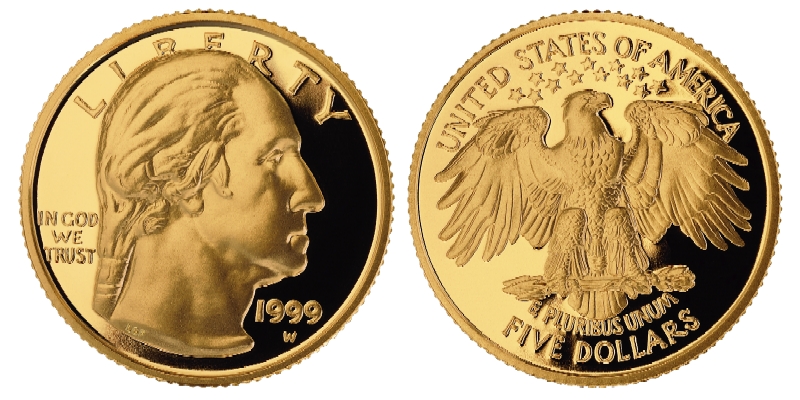
Yes, this is the design that was rejected back in 1932. Why? Because the designer, Laura Fraser, was female - and the Director of the Mint was an asshole.
Now, as to the Statehood quarters, I’ll concede that they are a shot in the arm for the coin collecting hobby - and for the scam artists on the Home
The Kennedy half. Beside the overengraving and flattening that afflict the Lincoln cent and the Washington quarters, there are no serious flaws with this coin...save for the fact that it does not circulate. Too bad. I remember when half dollars were a routine component of pocket change; I miss those days.
The Sacagawea “Golden Dollar.” Until they kill the dollar bill, this reasonably good-looking coin doesn’t stand a chance. [She Who Must Be Obeyed is always tickled when I rant on and on about this topic - until she realizes that excessive interest in coins (and stamps) is like the E-ticket to Nerd-O-Rama.]
I say, take Abe off the cent - he’s on the five-spot, fercryingoutloud - and slap someone else on there. Ben Franklin comes to mind. Yes, he’s on the C-note, but Poor Richard deserves to be honored with something more down-to-earth. Better yet, kill the one-cent coin off entirely, put Franklin on the dime...and use Laura Fraser’s classic design for the Washington quarter, as should have been done 73 years ago.
Who’s with me?
Oh, yeah...and this design for the Louisiana quarter? Just plain wrong. [Bwah hah hahhh...]


No comments:
Post a Comment