It seemed that everyone was trying to use maps to make points about red states, blue states, red counties, blue counties, on and on and on.
Well, Michael Gastner, Cosma Shalizi, and Mark Newman over at the University of Michigan have come up with several inventive ways to create graphical interpretations of the 2004 election results. What they’ve done is to create a series of cartograms - maps in which the area of the various political units (states or counties) is adjusted to reflect their population or electoral vote count. It conveys (I believe) a better picture of the relative political strength of the various parties - the acreage of the states or counties, which is what shows on a normal map, really has nothing to do with how many voted wingnut or moonbat.

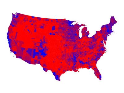
Conventional map showing 2004 election results by county.
Here’s a conventional map that shows the 2004 election results by county. The color scale is nonlinear - solid red for 70% Republican or more, blue for 70% Democrat or more, shades of purple in between. Note that there are a lot of ways to play with the colors, depending on how you want to spin the data or what, exactly, you are trying to measure. You can use solid red or blue to show who won - or more important, who is running things. Or you can blend the red and blue to reflect the actual percentage results, which gives you a better picture of the blend of voters in a given geography. The image shown is a sort of compromise between these extremes, but I like it from an esthetic standpoint.
Now let’s look at a cartogram that shows the same data, using the same color scale. Here, the counties have been scaled to reflect their population. The result is a strange-looking (but perversely beautiful) map of the country, one that shows a lot more blue than the first map.

Cartogram showing 2004 election results by county.
You can find more here.
Data and art: who’d ’a’ thunk it?


No comments:
Post a Comment