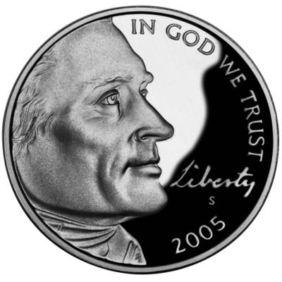
I really like the bold new profile of Jefferson on this year’s Five Cent Piece. I’m still waiting to get one of these bad boys in my pocket change, but it’s just a matter of time.
I can’t say I care much for the image of the “Buffalo” on the reverse (actually, of course, it’s an American Bison), because James Fraser did it so much better with his beloved Indian Head nickel design back in 1913. (That’s the design that was used for a commemorative dollar in 2001, sorta like reissuing a prime porterhouse steak as a porterhouse-shaped hamburger.) Alas.
But the “Ocean in View” reverse that will come out later this year is Damn Fine.
The U.S. Mint has become an expert merchandiser, but what I’d really like to see is a reimagining of our circulating coinage. This new nickel is a step in the right direction, and I hope they don’t backtrack next year, when (by law) they restore the image of Monticello to the back of the coin. Maybe a nice three-quarter view of the building instead of the boring Piece o’ Crap elevation we had from 1938 until 2003...that’s sixty-five years, people!!! And let’s keep that dramatic portrait from this year’s model, OK?
And would it kill ya to have some kind of Panel of Real Artists to make sure that 80% of the current Statehood Quarter designs never see the light of day? There have been a handful of beauties, but most of ’em are as ugly as a Cancer-Eyed Cow. That’s what happens when the creation art is relegated to a committee.
Ahhh, I could rant on and on about this subject for hours, but SWMBO never fails to remind me that excessive interest in Coins and Stamps is a veritable Hallmark of Excessive Nerdliness. So I will drink deep the draught of Shut the Fuck Up.
Carry on.
Update: One of the 2005 nickels showed up in SWMBO’s change today. Boo-Yah!


No comments:
Post a Comment